Meeting 01 - Course Introduction
Meeting Goals
This course meeting has an emphasis on the following goals:
- Introduce the basic themes of the course
- Critique an example web map and the process used to create it
- Construct simple interactive web maps using leaflet
Before Class
Tasks
- Complete all course onboarding tasks posted in Module 1 if you have not already done so (see Blackboard)
- Complete the two videos and the reading listed on the syllabus (see below)
- Submit Entry Ticket 1 (see Blackboard)
Open Data and GIS in Los Angeles
One of the course learning outcomes is titled “GISc and Public Policy”. Much of the data that we will use this semester is available to us because governmental agencies at the Federal, state, and local levels have published it and made it accessible. We call the movement to make as much data available as possible “open data”.
Different governments have embraced the open data movement to varying degrees, and the video below discusses Los Angeles' integration of open data and GIS. It is a 9 minute talk given by L.A.’s former Chief Data Officer Lilian P. Coral. The talk was part of a conference organized by ESRI, the makers of ArcGIS.
Once you’ve watched the video, check out the web application featured in the video that visualizes pedestrian and cyclist injuries in Los Angeles. You can also visit L.A.’s open data website called GeoHub.
Analysis Development
Making a produce like L.A.’s visualization of pedestrian and cyclist injuries is a complicated effort. Data must be obtained from various sources, modified (a process we call “data wrangling” or “data cleaning”), and then linked with map coordinates. Once it is ready to be mapped, the web application must be designed and created. We’ll call this large-scale process a “workflow” this semester.
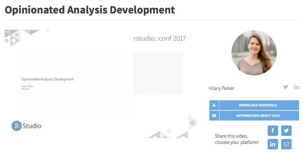
The workflow that we’ll use is opinionated - there is a strong premise that underlies the workflow about the ways in which spatial data (and data more generally) should be obtained, stored, modified, and mapped. Hilary Parker is a data scientist at Stichfix and also runs a data science podcast called Not So Standard Deviations. She has been speaking recently about an idea called opinionated analysis development. The video linked to below is a 25 minute talk she gave on this idea last year, and she now has a draft paper out on the topic as well. Our workflow for this semester is closely linked to the ideas she discusses in this talk.
Many (but not all of you) will have experienced some parts of these processes before. Perhaps you’ve used Microsoft Excel to organize some information or used SPSS to analyze some quantitative data. We won’t be using those tools. Instead, this course will emphasize the use of other tools that support reproducible, accurate, and collaborative data analysis. Throughout the semester, we’ll discuss why these tools are important and the advantages they have over other products that are out there. Inspired by Hilary’s idea of opinionated analysis development, our goal each week will be to focus on the processes that can be used to increase the reproducibility and accuracy of our geospatial work.
Some of these processes, like using RMarkdown, are introduced in the introductory “chapter” (it is quite short!) to Duke University sociologist Kieran Healy’s primer The Plain Person’s Guide to Plain Text Social Science. This is the one required reading for the entry ticket (though there are several optional ones listed on the syllabus.
Many (but not all of you) will have experienced some parts of these processes before. Perhaps you’ve used Microsoft Excel to organize some information or used SPSS to analyze some quantitative data. We won’t be using those tools. Instead, this course will emphasize the use of other tools that support reproducible, accurate, and collaborative data analysis. Throughout the semester, we’ll discuss why these tools are important and the advantages they have over other products that are out there. Inspired by Hilary’s idea of opinionated analysis development, our goal each week will be to focus on the processes that can be used to increase the reproducibility and accuracy of our geospatial work.
Some of these processes, like using RMarkdown, are introduced in the introductory “chapter” (it is quite short!) to Duke University sociologist Kieran Healy’s primer The Plain Person’s Guide to Plain Text Social Science. This is the one required reading for the entry ticket (though there are several optional ones listed on the syllabus).
Lecture-01 Entry Ticket
The entry ticket for the first lecture asks three follow-up questions about these videos and L.A.’s interactive website. Please answer these questions and submit them before class on February 1st. Answers must be submitted through Google Forms and each response should be three to four sentences in length. The questions are provided here for reference:
- Briefly describe how the City of Los Angeles uses data and mapping to inform how they deliver city services.
- After viewing the interactive map showing pedestrian and cyclist injuries, describe what you thought of the map. Some example considerations could include: was it easy to read? to navigate? did you like the colors? was it missing relevant data?
- In your own words, what are the key aspects of opinionated analysis development?
- What are some of the advantages of using plain text for data analysis?
The entry ticket also asks for an update on your course onboarding process.
During Class
Slides
After Class
Tasks
- Complete Lab-01 after and come to Meeting 02 prepared to submit it
Lab-01
Please finish Lab-01, which is located in the module-1-intro folder you already download in assignments/lab-01/docs/lab-01.Rmd. Once you’ve opened that (use the lab-01.Rproj R project file in assignments/lab-01), you’ll need to round-out the narrative text, add code to open the grocery store data (located in assignments/lab-01/data), and make an interactive map of grocery stores in St. Louis City and County using leaflet. All of this can be accomplished using the code we used in class today. A replication file is already present in the assignments folder as well.
Sample Maps
In class, I mentioned that I thought some of my favorite maps are the National Park Service’s visitor guides for each of there “resources” (NPS lingo for different parks, monuments, and sites) and James Niehues' legendary ski area maps. The NPS brochures themselves aren’t available online, but some of the maps are! Here are some samples:
- James Niehues' map of Big Sky, Montana
- A collection of Niehues' basemap art without labels, legends, etc
- Acadia National Park (Maine)
- Denali National Park (Alaska)
- Yellowstone National Park (Wyoming)
All of the National Park Service maps are available via npmaps.com, which catalogs them because different parks make different types of maps available.